Figmaistor: Engaging Animation for New Course Launch
Project Overview
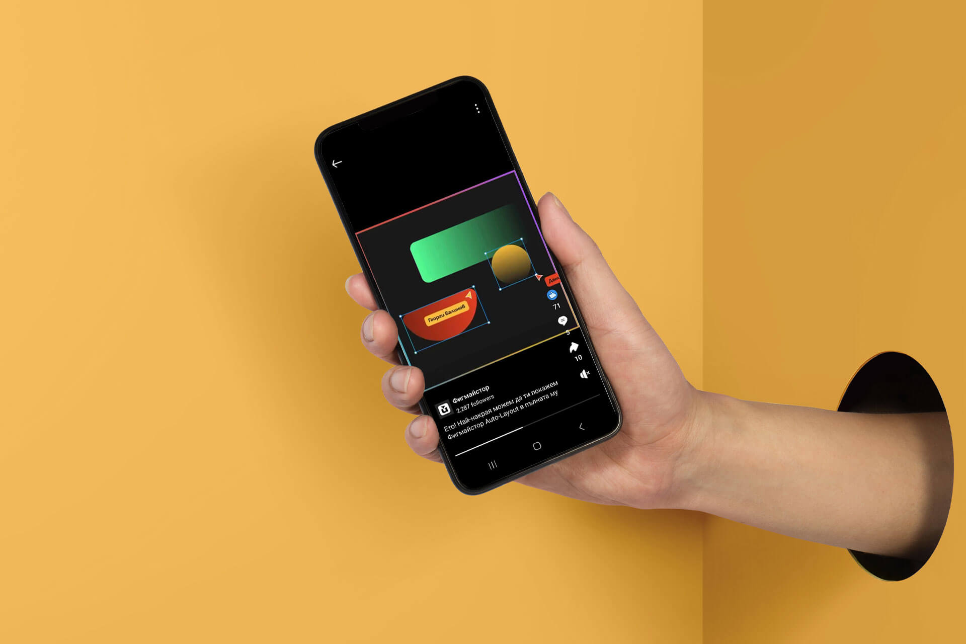
In the middle of July 2024, the founders of Figmaistor approached me to create a short animation video to promote their new Figma course focused on Auto Layout. They provided me with a storyboard and a work file containing illustrations and images. My task was to bring these elements to life through animation, ensuring the video was engaging and cool.
Process
1. Storyboard & Assets Review
Upon receiving the storyboard and work file from the founders, I thoroughly reviewed all the illustrations and images. This helped me understand the visual style and the specific elements that needed to be animated.
2. Animation in After Effects
I then imported all assets into Adobe After Effects. My focus was on creating dynamic and engaging animations, emphasizing smooth transitions and visually appealing movements. I ensured the animation style aligned with Figmaistor’s brand and the promotional goals.
3. Communication & Feedback
Throughout the project, I maintained regular communication with the founders to ensure my work aligned with their vision. After completing the initial animation draft, I presented it for their review. Based on their feedback, I made revisions to refine the animation.
4. Finalization
After incorporating the necessary adjustments based on the founders' feedback, I finalized the animation. The result was a polished and engaging promo video for the Auto Layout course, which met all the expectations set by the founders.

Outcome
The final animation video effectively captured the essence of the Figma course on Auto Layout, presenting it in an engaging and visually appealing manner. The collaboration with the founders was smooth, and the project was completed successfully, meeting all expectations. Working on this project was a rewarding experience, allowing me to creatively express the features of Figma’s Auto Layout through animation.


