Lancaster Branding: Strategy, Design, and Execution
Project Overview
In 2020, I undertook a student project to create branding elements for Lancaster, a fictional family business specializing in luxury cutlery and high-quality porcelain. The company, founded by the patriarch Lancaster, prides itself on producing products that embody pure forms, exquisite materials, and the beauty of minimalism. The branding project aimed to honor Lancaster's legacy and reflect the company's dedication to craftsmanship and elegance.
Objectives
The primary objective was to develop a cohesive brand identity that honors the founder's memory and showcases the company’s commitment to quality and minimalism. This involved creating various branding elements that incorporate Lancaster’s character, the use of thin lines, minimalist designs, and his favorite blue color.




Role and Contributions
As the sole designer on this project, my responsibilities included:
- Conducting research on similar companies.
- Conceptualizing and designing the brand identity.
- Developing key branding elements.
Design Process
1. Research and Concept Development
The project began with a thorough exploration of the history, values, and products of comparable brands. Taking into account the fictional backstory of the founder, it was essential to highlight the founder's influence and the company’s dedication to minimalism and high-quality materials. My objective was to craft a brand identity that both honored the legacy of the old Lancaster and mirrored the company’s elegant, minimalist aesthetic.
2. Visual Identity
Logo
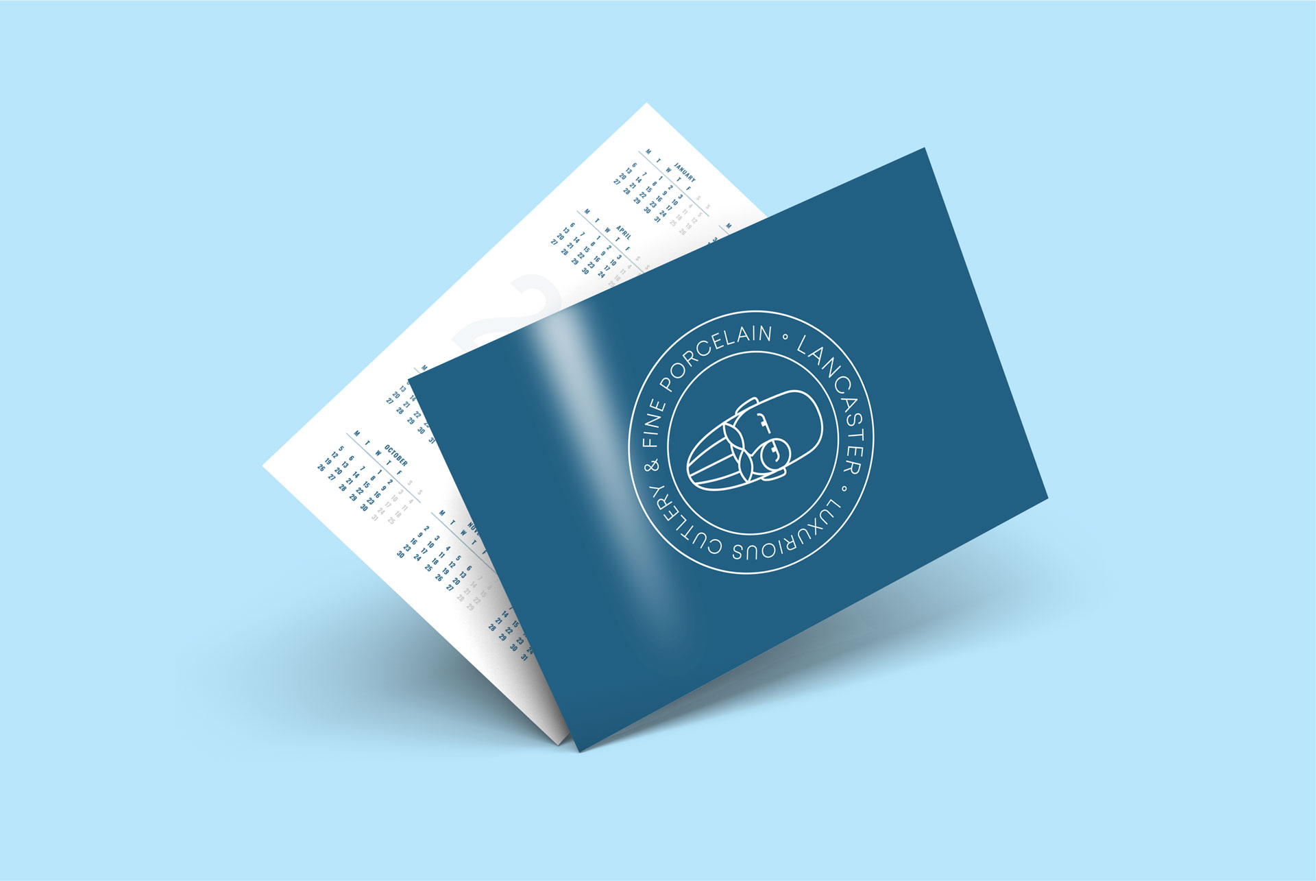
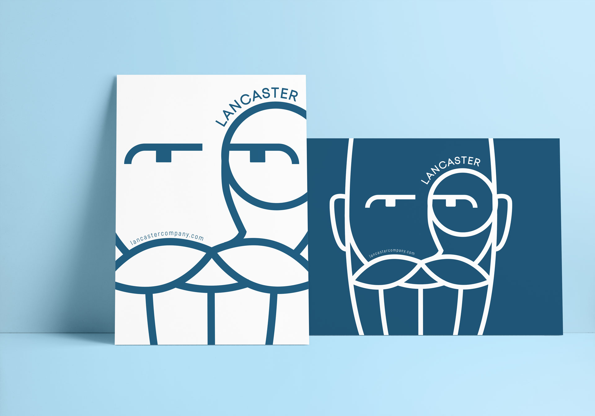
The logo design centered around the character of Lancaster, incorporating his image in a stylized, minimalist form. Thin lines were used to create a sophisticated and elegant representation of his likeness, emphasizing his significant role in the company's history.
Logotype
The logotype featured a clean, modern typeface that complemented the minimalist design philosophy of the brand. The use of Lancaster's favorite blue color added a personal touch and a sense of continuity with the brand's heritage.
Typography
A sans-serif typeface was selected for its modern and minimalistic appeal, ensuring readability and a sleek aesthetic. The typography was consistent across all branding materials, reinforcing the brand’s identity.
Color Palette
The primary color was Lancaster’s favorite blue, chosen for its association with trust, sophistication, and serenity. This color was complemented by neutral tones to maintain a clean and elegant look.


3. Branding Elements
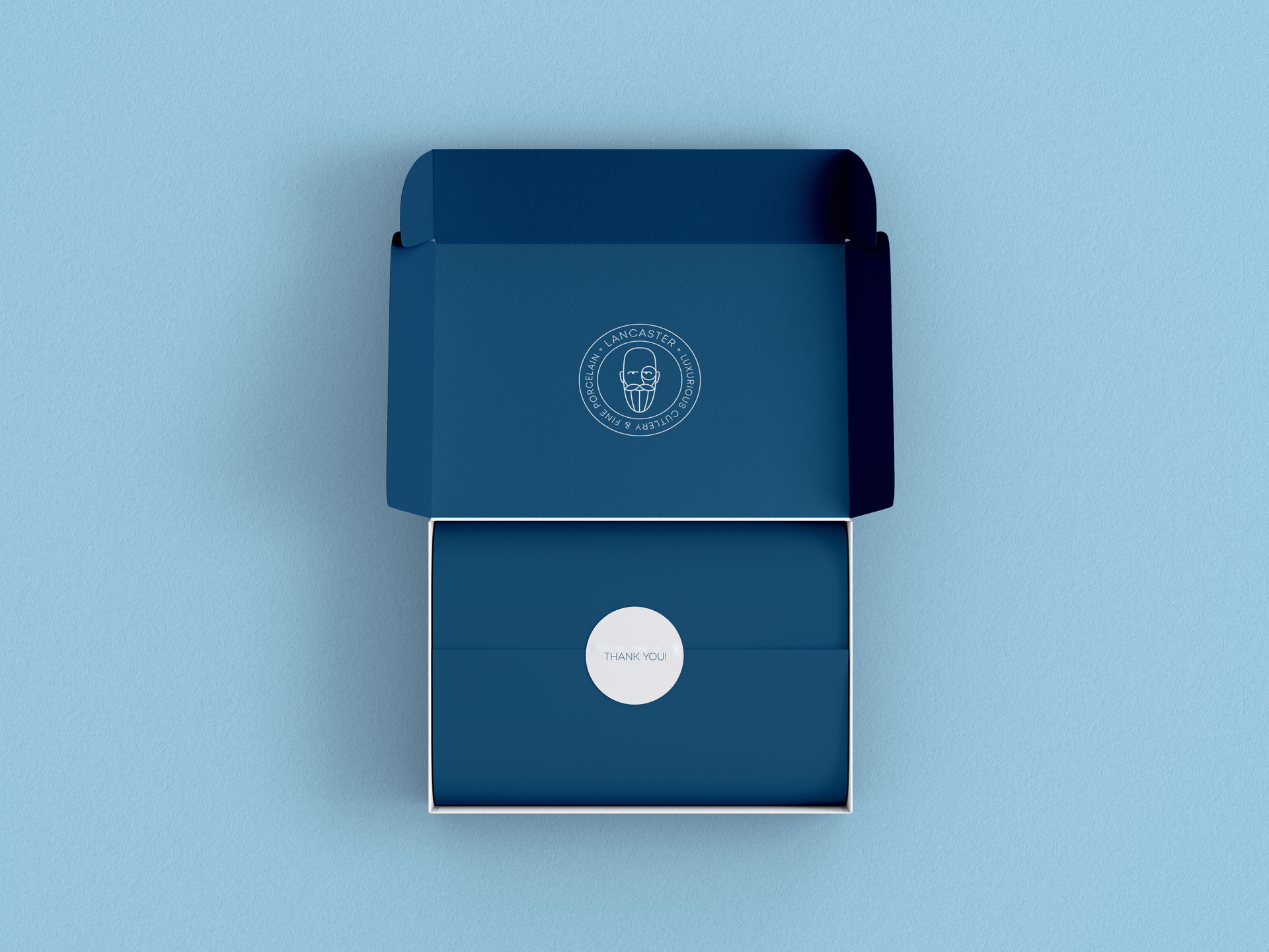
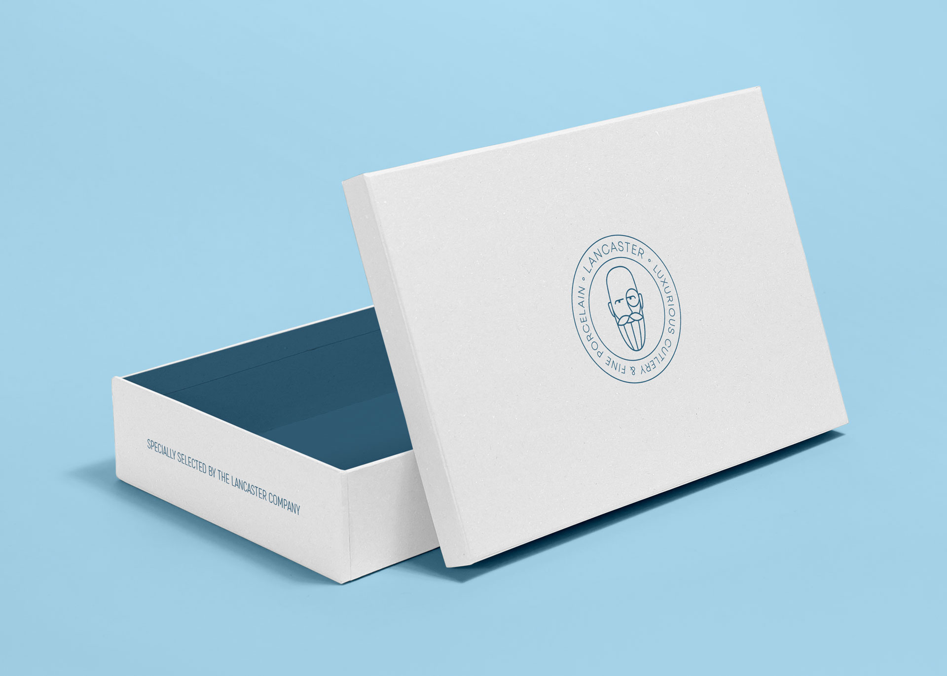
In developing the branding elements for Lancaster, I aimed to create a cohesive and elegant identity that reflected the company’s commitment to minimalism and high-quality materials. This comprehensive branding package included a variety of items designed to ensure a consistent and professional appearance across all touchpoints.
Stationery and Office Supplies
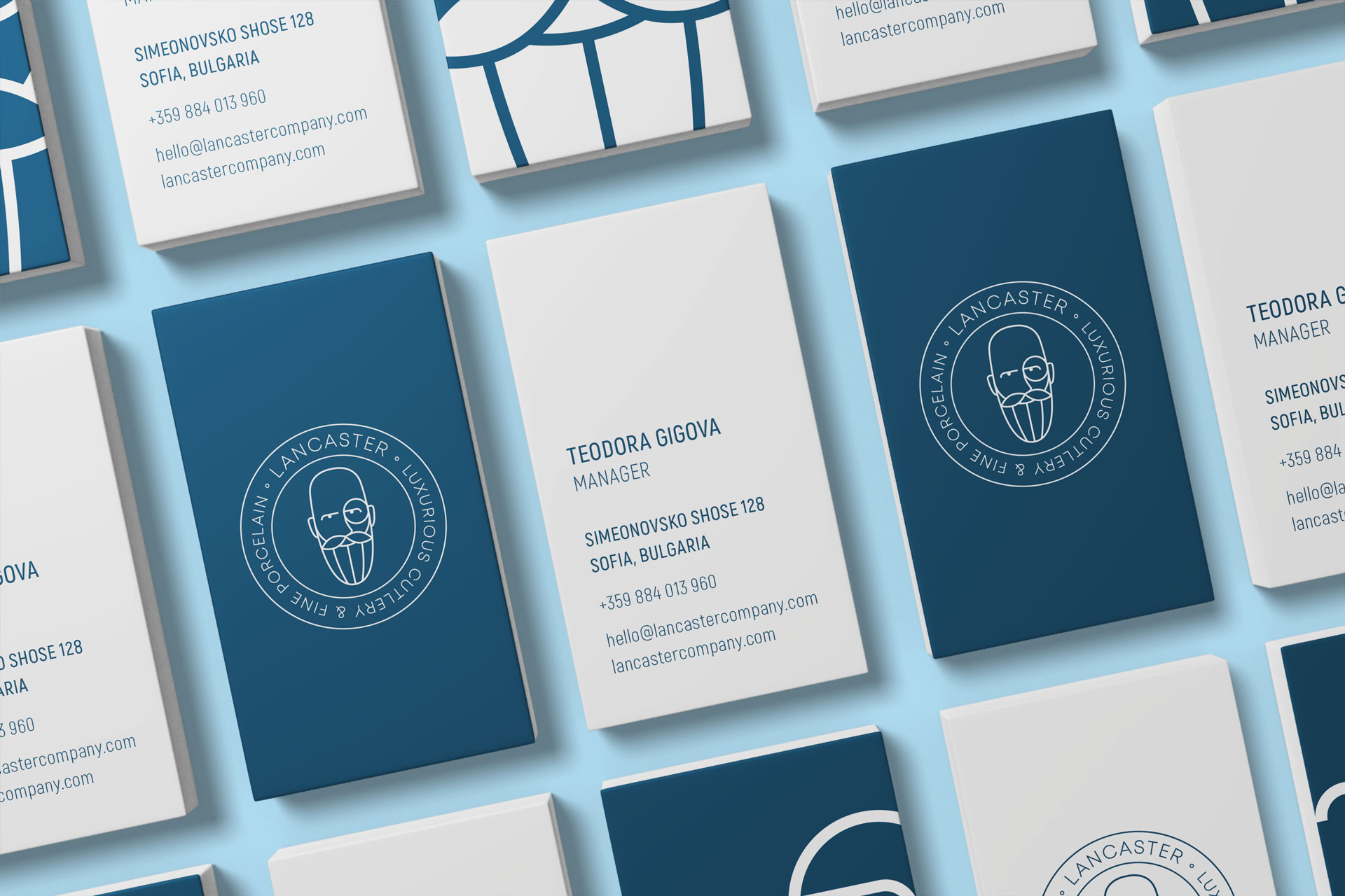
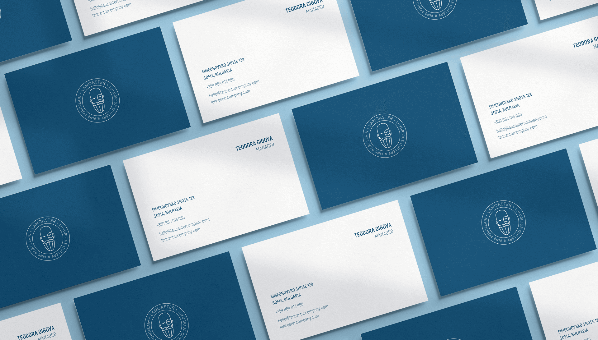
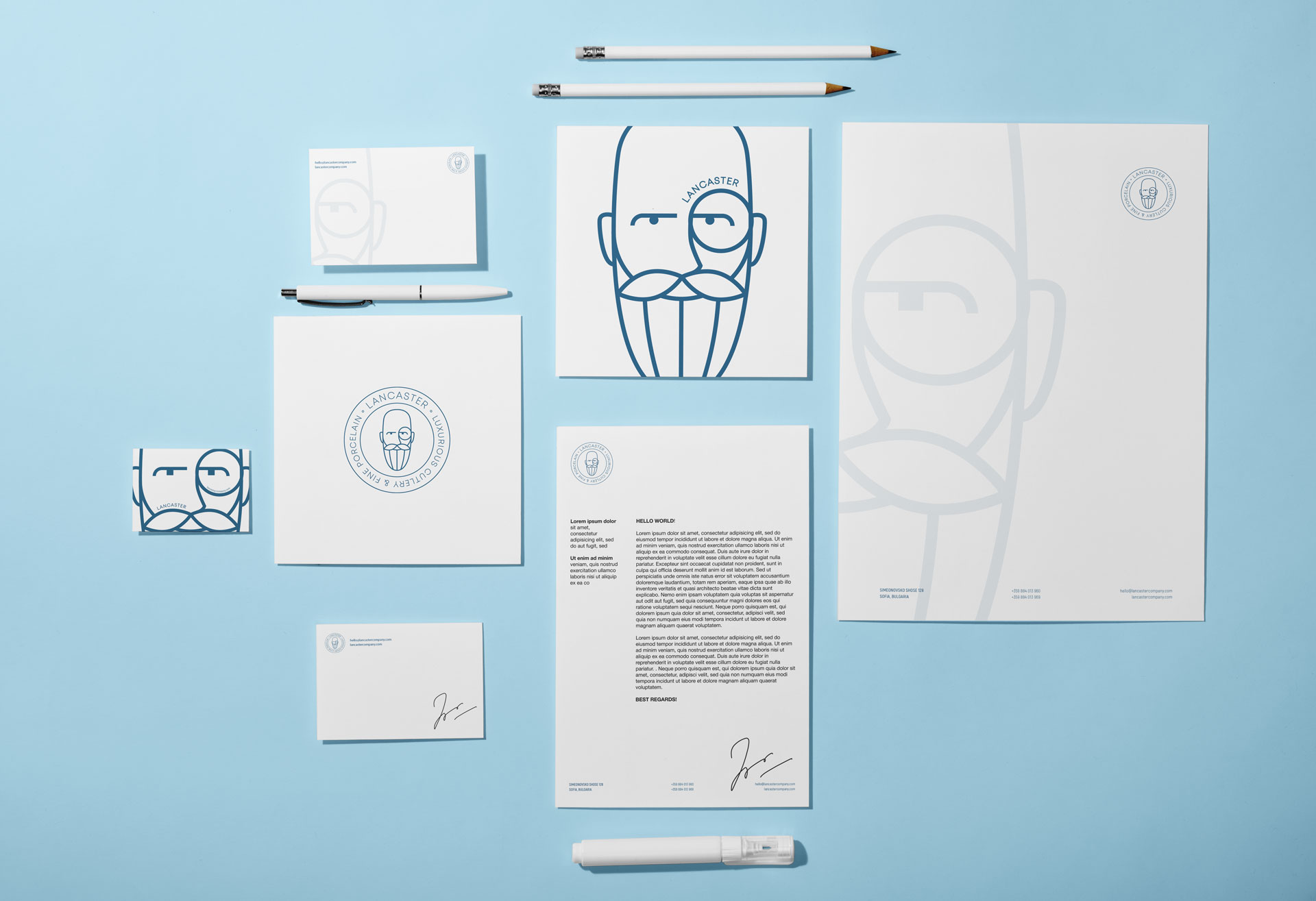
I started by designing basic office items like business cards, envelopes, and document templates. Each item was made to look simple and elegant, just like Lancaster's style. The business cards had a clean and straightforward design, while the envelopes and templates matched, making everything look professional and consistent.
Promotional Materials
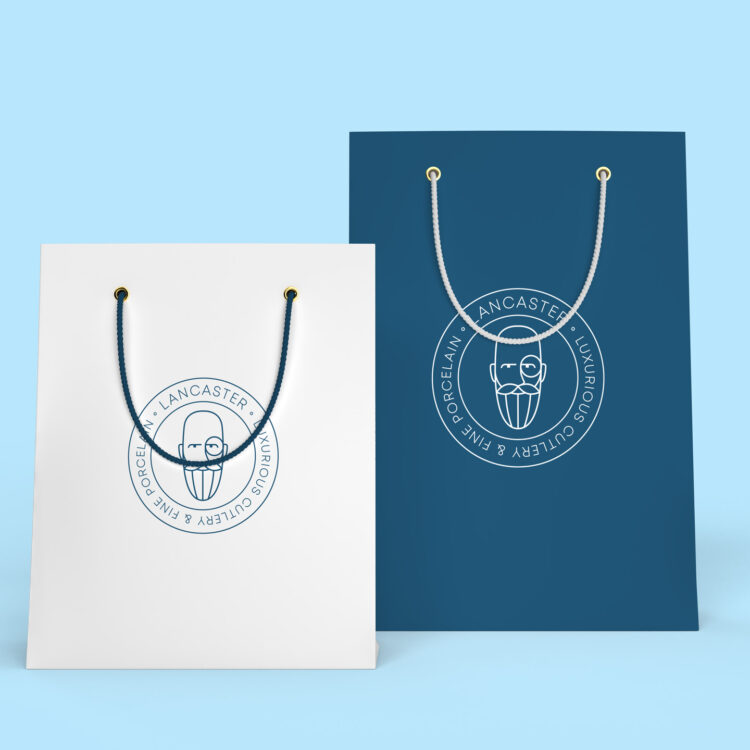
Next, I developed a range of promotional materials that would extend Lancaster’s brand presence. This included pens, pencils, paper, and textile bags, each bearing the company’s refined logo and color scheme. These items were designed not only for functionality but also to reinforce the brand’s aesthetic in everyday use.
Apparel and Accessories
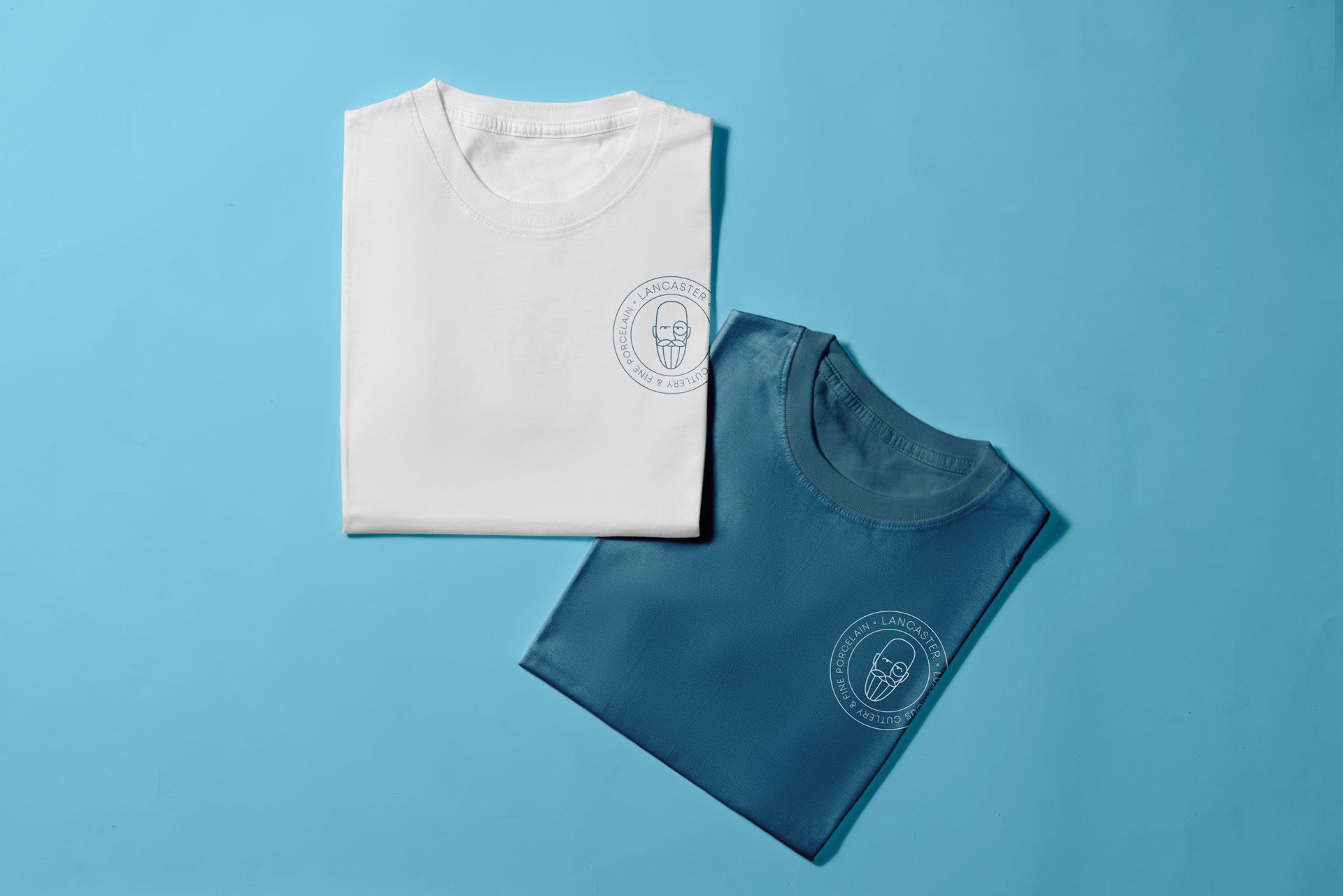
To further promote brand visibility, I created a line of branded apparel and accessories. This included shirts, caps, glasses, and mugs, all designed with Lancaster’s minimalist ethos in mind. The apparel featured subtle branding elements, ensuring that the items were stylish and wearable while still promoting the company.
Branded Vehicles
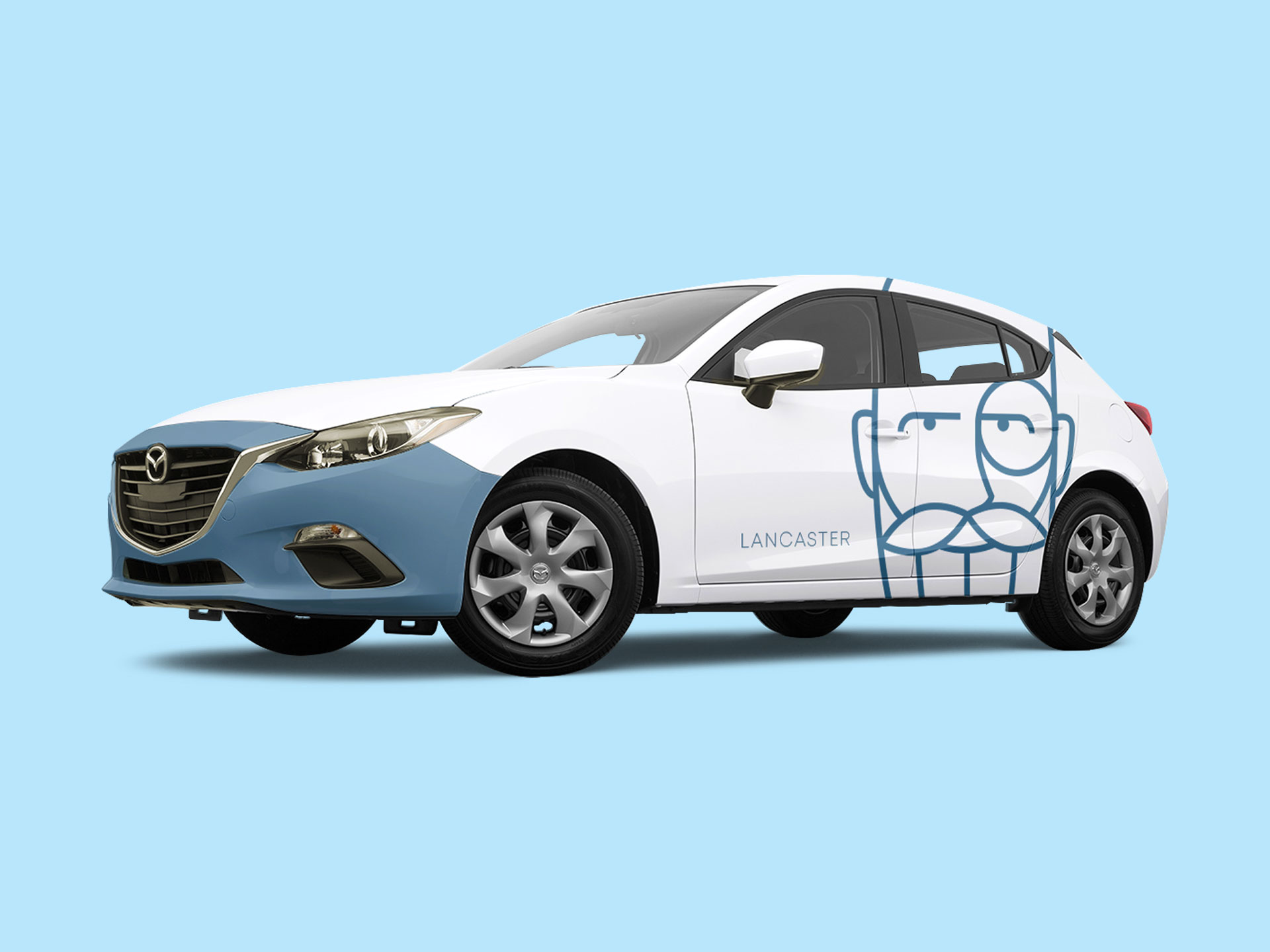
Understanding the importance of mobile branding, I also designed branding for Lancaster’s vehicles. The cars featured a sleek and modern design with the company’s logo and colors prominently displayed. This ensured that whether the vehicles were on the road or parked, they served as moving advertisements for the brand.
Additional Branded Items
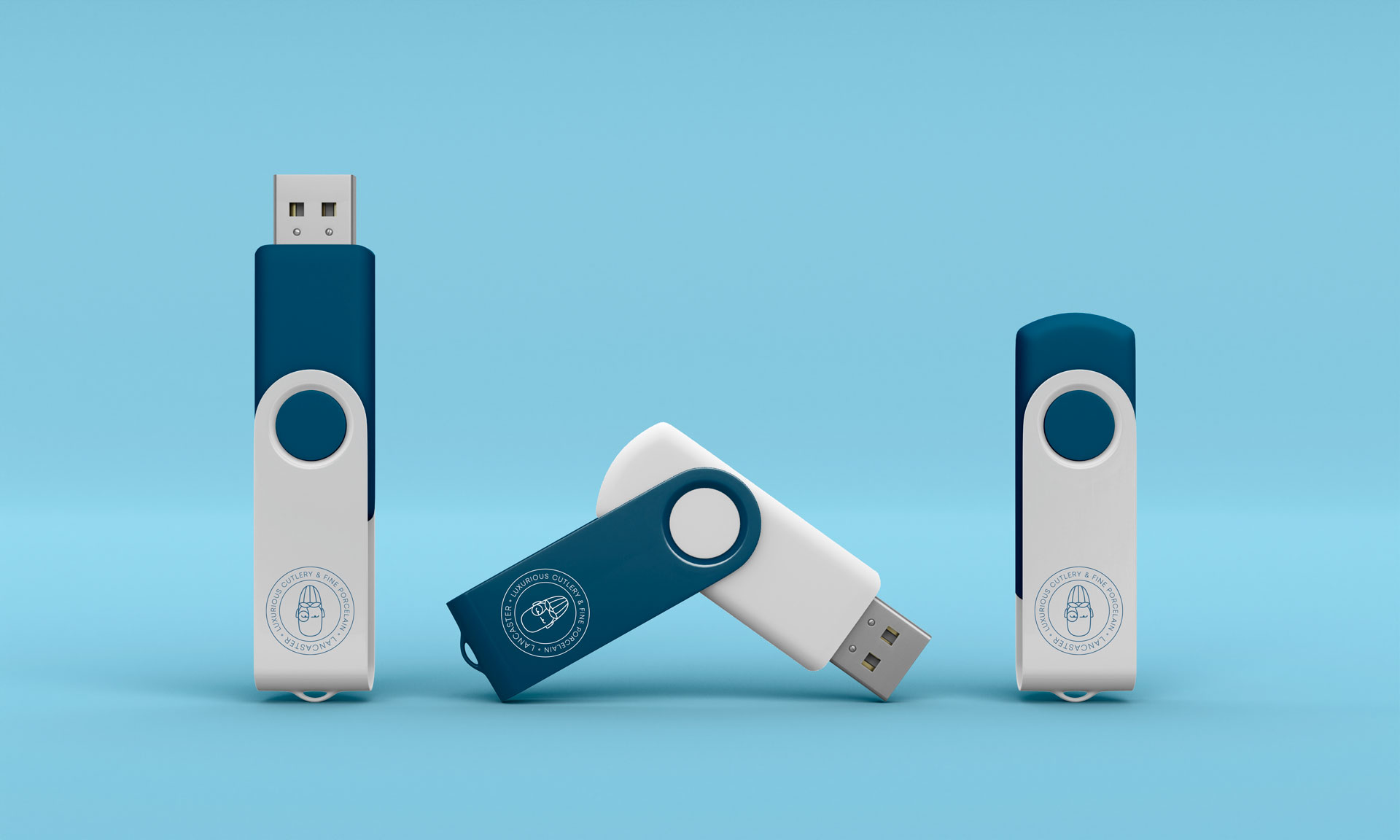
Beyond the standard promotional and office items, I expanded the branding suite to include various other items that would be used in different contexts. This comprehensive approach ensured that every interaction with the Lancaster brand, whether through a branded mug in the office or a company car on the road, was consistent and reflected the company’s values of elegance and high quality.
Each element of the branding was designed with the goal of creating a seamless and unified brand experience. By focusing on minimalism and high-quality materials, we ensured that the Lancaster brand stood out in a crowded marketplace, providing a strong foundation for the company’s identity and future growth.
Each element of the branding was designed with the goal of creating a seamless and unified brand experience. By focusing on minimalism and high-quality materials, we ensured that the Lancaster brand stood out in a crowded marketplace, providing a strong foundation for the company’s identity and future growth.




Outcome
The branding project for Lancaster successfully created a cohesive and elegant brand identity that honors the founder’s legacy and reflects the company’s values of minimalism and quality. The use of thin lines, minimalist elements, and Lancaster’s favorite blue color effectively conveyed the brand’s sophisticated aesthetic.
Heritage and Modernity
Balanced the respect for Lancaster’s legacy with a modern, minimalist design approach.
Cohesive Visual Identity
Developed a consistent visual identity across all branding elements, enhancing brand recognition.
Luxury Appeal
Ensured that all designs reflected the brand’s commitment to luxury and high-quality craftsmanship.
Reflection
This project was a valuable experience in creating a brand identity that respects and celebrates heritage while embracing modern design principles. It reinforced the importance of understanding a brand’s history and values in developing a cohesive and meaningful visual identity.


